Greg Cordover
Thoughts & projects
Twitter Visualizations
Twitter is an interesting website, especially considering how basic its premise is: 140 character “status updates”. With these, you can talk about something briefly, share something interesting, or mention other users. I’m going to talk a bit about mentioning users here today.
Twitter, from my experience, is extremely cliquey. There are certain groups of people who mostly mention or “subtweet” (referring to a user without actually mentioning them) each other very frequently, and only rarely mention someone outside of this group.
I decided to see if I could find a statistical basis for my thought. Using a few node.js scripts I wrote, I compiled some data then used Gephi to output something nice to look at. These scripts started with a single user, me in this case, and went through my last 200 tweets (the most returned by Twitter in one API call), and found how many times that user mentioned people. Then, it would go through all the users found in the mentions of those people. This collected 19,937 users, starting from just me and my most recent 200 tweets! Between these 19,937 users there were a staggering 35,996 different connections! This doesn't even count the total number of interactions, just the number of unique connections between users. There were far more interactions between users than this. After converting this data to CSV, I was able to import it to Gephi where the fun could happen.
Thankfully, Gephi had many functions built in that could handle such a large dataset (although I did have to allocate 4GB of RAM to export the final result). The first function I ran was the modularity report, which figured out which users were part of what “group”. Each “group” was a collection of users who frequently mentioned each other. For almost 20,000 users, there was only around 42 different groups, and just about all of them had more than 100 users, with the largest reaching over 1,500 users.
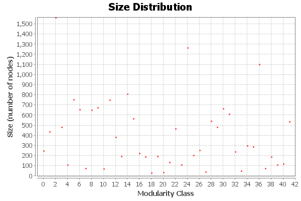
This suggests that Twitter wasn’t nearly as cliquey as I had previously thought; there were actually very few groups, and a large number of them were outliers, as you will soon see.
Using Gephi's Force Atlas and coloring methods, I could generate an image that would show the connections between users, how “close” users were (based on how often they interacted, represented by position), and what “group” these users were in (represented by color).
After running these functions (it took a while!), I was finally able to get a nice result.
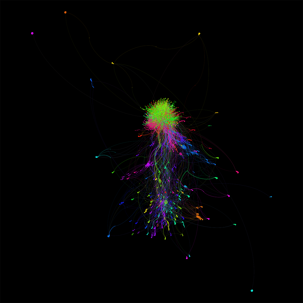
Users closer to the middle were more part of the group. Users further away seem to be more “outliers”, users who were mentioned by just one or two users and are within their own little group.
Now, I thought, where could I go from here? I found a JavaScript library called Sigma.js, which graphs this kind of data in an interactive format. This allows for people to interact with it, search for users, see connections between users, etc. This allows you to really visualize the connections from a user or to a user quite easily.
That’s about it for this post! In the future I’d like to try and go three levels deep (this was two levels deep), but it already took nearly an hour to fetch all this information from the Twitter API. It’d also be questionable whether or not any of my tools could actually interact with such a large dataset.