Greg Cordover
Thoughts & projects
Twitter Visualizations, Again
A while back, I did some visualizations about Twitter’s grouping.
Recently, I went back and ran some updates.
This time, instead of calculating groups, I mapped out the connections between groups.
This was the initial result, generated the same was as last time.
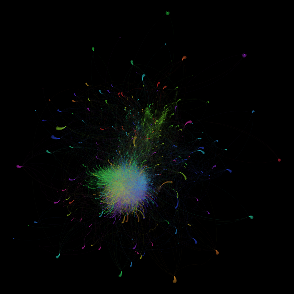
This image doesn’t really look too much different.
I then limited the connections to users who had just more than two mentions.
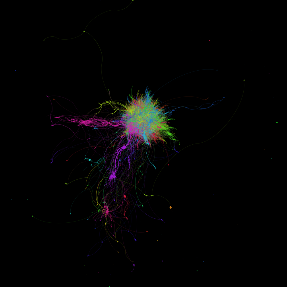
Here’s where it got interesting! It seems that there’s some groups that just talked once or twice.
Naturally, I had to keep going. I filtered it to four connections to get graphed.
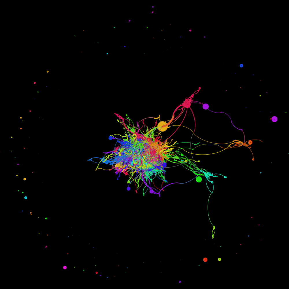
This really shows that Twitter’s groups really are mostly isolated groups, with just a few connections.
It’s also quite beautiful!